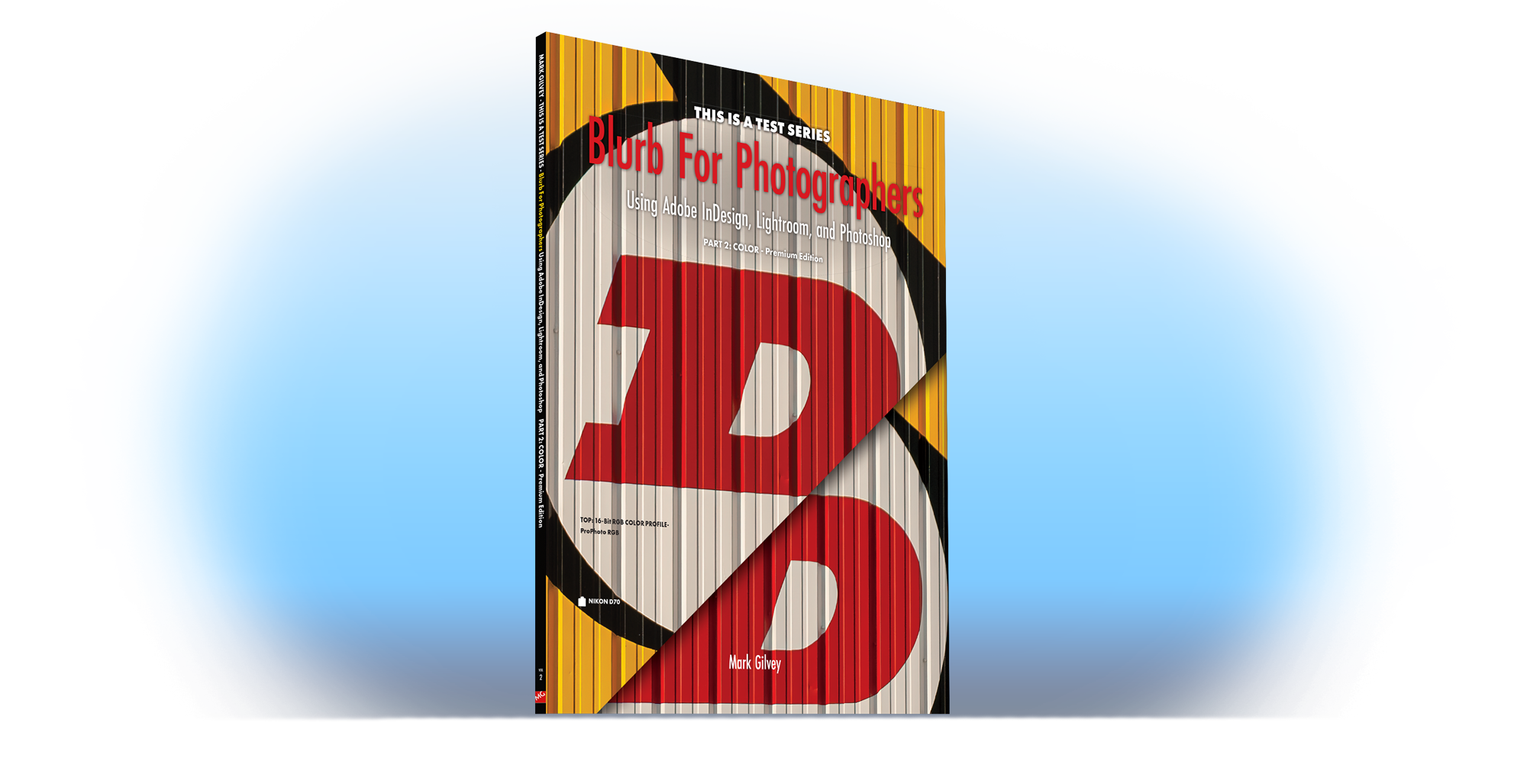
Blurb for Photographers
Using Adobe InDesign, Lightroom, and Photoshop
PART 2 – COLOR – Premium Edition
Presenting the best print-on-demand tips for color photography self-publishing projects.
Are you a Color photographer who dreams of self-publishing a book of your work? If so, you’ve come to the right place! I made this book so that I could get a better idea of how Color images would print, using print-on-demand. I liked it so much, I decided to design it with an advanced, or Professional photographer in mind. This book is packed with tips and advice on formatting your images for print.
Here are just a few of the things you’ll see first-hand in this book:
- We’ll look at how to preview your images, so you know what colors will not print
- What an image will look like with a .5pt stroke vs. a heavier stroke
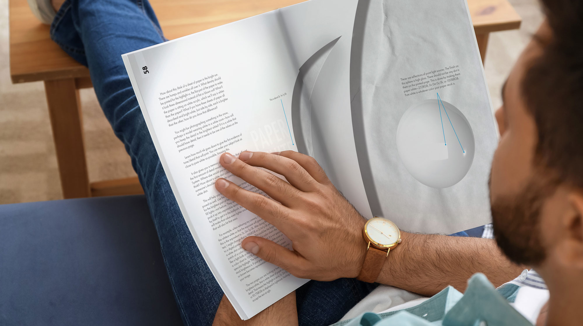
- How to simulate a specular highlight in print
- Discover how far away your image should be from the gutter
This book is the perfect resource for any color photographer who wants to self-publish a book. With its clear and concise advice, you’ll be well on your way to creating a beautiful book—just as you envisioned.
Whether you’re an experienced shutter-bug or Professional Photographer, this book has something to offer you. So, what are you waiting for? Don’t wait until after you get your masterpiece back and discover the grayscale images don’t look as you expected. Start your journey to self-publishing today with better knowledge about what to expect!
Order your copy today and get those masterpieces off your hard drive and out in the open!
PART 2 PREPARING COLOR PHOTOGRAPHS FOR PRINT-ON-DEMAND
Table of Contents
- Color: All its finicky issues
- Whiter Than White: A recap from PART 1 on white point
- Gamut & CMYK: The tale of Gamut and Smyke (CMYK)
- Paper Stock: Glossy, Matte Velvet, or Mystery Stock
- Color Tests: Same drill as B&W tests in PART 1, but with more color
- Page Layout: Get the control you want over your margins, fonts, transparent backgrounds, and silhouettes
- Grids, Indents, and Fonts – Oh My: Controlling how your type looks
- Ghosted Backgrounds: How to make type legible over busy backgrounds
- Paragraph Faux Pas: How to make your text look good, so you don’t embarrass yourself
- Layers in InDesign: Because you don’t have to do it all in Photoshop, nor should you
- Line Weight: How small or large of a border should your image have
- Hard & Soft Silhouettes: Add some graphical features to your layout with silhouetted images
- Masking in Lightroom: Add impact or drama to your photos by putting corrections where you want them.
- Glossary: More terms you might not be familiar with

